Navigators Project Launch

Monday, we launched the second project, Navigators, and I am starting this project in a slightly different position, as a Communications student. While working on Manifesto, I started to get some inklings that my direction for where I wanted my work to live and its readability didn’t feel quite right in Fine Art.

I talked to Nathan while finishing up Manifesto, and I described being in Fine Art like wearing a slightly oversized coat–still wearable, but it didn’t feel quite right. Further, it felt like an oversized coat with magnets in the pocket, which was leading me to Communications.

The launch of Navigators came with a tutorial of how to use video equipment as well as with a brand new briefing and an introduction to the idea of wandering through a city as a flâneur. This reminded me a great deal of a course that I took when I was in university, which had a syllabus that was structured around the organization of Paris into its twenty neighborhoods. Each day, we would have readings that were particular to one of the twenty neighborhoods, and in the afternoon, we would go out and explore.

However, now Neveah and I are the ones that have to curate that navigation of space to create a time-based work in reference to what we find. In order to set us up for this kind of curated experience, we did an exercise by which we made 2 minute video tours for our partners. They were about places in White City that we felt strongly about, and after we produced our video, we would swap with our partner in order to go on they journey they set up for us.

I ‘brought’ Neveah to the purple sign that points to the Royal College of Art.

I took her on a slightly stream of conscious journey through my impressions of this place and my musings about the Tesco truck in my direct vicinity. It was all very silly, but it was interesting to have her receiving presence in mind while making the video for her.

When I got her video, it was really interesting to be in her direct ‘spot’ as the person behind her video camera with the proximity of the voice from her phone’s speaker like having her walk along side me. There was a lag in the step, but that is what made our different points of view compelling, and it really set us up for the spirit of working as a pair.

Manifesto: Presentation

Last Friday, we presented our manifestos, and it was wild to be finished. Our group decided to present by the structure of our zine and the dichotomies involved. We opened with Neveah’s reading of the manifesto in her ’round’ of digital voices, and then we went into an explanation of the zine structure into each of individual components.

We had a powerpoint to back our explanation with key images from our zine, and we thought that the timing of the presentation would keep us on track, but we ended up going over anyway because we had a lot of physical elements to our presentation, which factored in some additional hassle time. We also had a small performance element to incorporate, which was Connie’s response.

The group was very glad to have brought in our works to allow people to touch them and interact with them as objects rather than just images in our zine. What had created, ultimately was far more than a publication. The zine was an important lens to filter our response, but the dialogue and the works went far beyond our tiny publication with 15 x 15 cm pages.

The discussion around the works was by far the most important point. We were asked about sustainability–as we had collectively used a lot of plastic in our presentation of materials, but working with plastic over glass was a necessary material choice in our case, as I needed to use the laser cutter. Additionally, when creating sustainable artworks with money out of own pockets and limited time constraints, plastics that are lying around tend to be the easiest option. However, this is an important consideration going forward.

Too, with regards to my project in particular, I was asked about pacing and about use of different materials on the screen. KyungHwa pointed out that I could have used different materials to slow down and resist the impact of touch, glasses and plastics with a courser grain, or even fabric that had a memory, such as velvet. Jess Morden, who was also working with touch in her approach to sustainability raised questions of how I could measure time beyond my own perspective, which is very, very fast.

Jess’ project raised some more interesting points for me to consider as well. She create these touch sculptures from clay and other natural elements. The first thing that struck me was that they were so cold, so the element of heat and temperature were entirely new areas by which we could both explore.

The presentation left me feeling relieved, unsettled, and inspired about the conversations and dialogues in the cohort going forward. Here’s to launching Navigators.

Manifesto: Putting It All Together

On the Thursday before the presentation, my group compiled individual pages into the final total zine.

My individual contribution to the zine

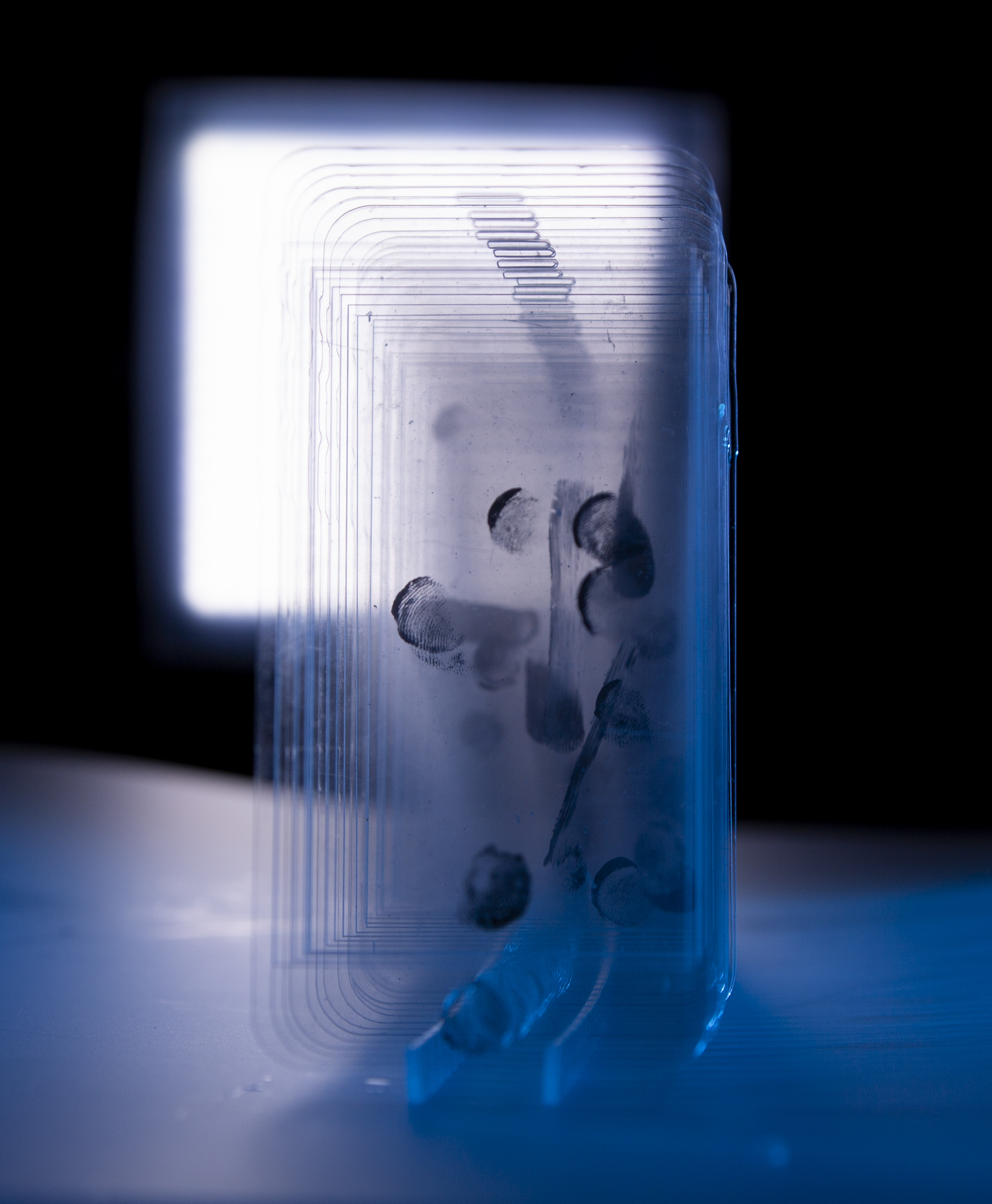
In my individual contribution, I ended up doing much more writing than I initially anticipated. It was also difficult to choose which images to put in the zine to represent the many experiments that the project ended up taking on. In reflection, I think I took up too much of the zine real estate with words and not enough with pictures. The pictures that I put in, particularly of the clear acrylic touch log are much more dominated by the blue and the light than of my fingerprints, which was more of the point, but hopefully bringing in the physical object to the presentation offset that a bit.

The entire zine together

When we printed the zine off as a unified shoot, it was quite interesting to see it all together. There was much less color than I had anticipated, but this form was only transient because it would take on an entirely different life as a folded object.

Francesca documented the folding of the zine, and the pictures above are hers. The entire zine was comprised of pages that were 15cm by 15cm squares. Taking such a large object and folding it into a square was intensely laborious, and Niko took charge on that. However, the folding process was something that was a direct subversion of the ways that we interact with our phones. It required intense precision and reorientation to pack this content into something quite exact. It also wasn’t exact because of the human element, but that’s what the zine ended up becoming, a human collage of an approximation of our experiences with our smartphones.

Last, Last Manifesto Experiments

With the zine structure in mind, and the countdown to final presentations looming, I decided that I had investigated the idea of the social connection with the phone through touch with a Fine Arts lens. Perhaps I had only scratched the surface, but I wanted to use the remaining time to put on a communications cap for a continuation of the conversation in a slightly different dialect.

I also just wanted to create some practical ‘things’ that were contained in the zine.

One of those was a screen protector. I had been thinking about touching the phone object a lot, and one object that is in the market that creates a barrier between our fingers and our phones is a screen protector. I thought the name of this object was interesting in and of itself. It raised the question of who is being protected? From what?

So, I wanted to create some functional screen protectors that were essentially the same object that was marketed in the store as a phone protector, but I wanted to flip the function to become a person protector. It would be sticker object that protects a user from the screen.

I played with many different forms and opacity to create these objects. Some were entirely opaque and black and white. Some were semi-translucent through the text ‘screen protector’ or just ‘protector’ in Helvetica Neue, which is the font that Apple uses in its promotional materials. The entirely opaque stickers completely blocked the viewer from the screen, but the stickers printed on clear vinyl still allowed users to interact with their screens with an obstruction.

Illustrator file of screen protector designs

I wanted to create these to have something readers could physically take with them from the zine. When putting together the zine writing, I did this by compiling a series of challenges for readers to take with them after reading with a similar idea. One of them was to use this screen protector. I wanted to play with the idea of the zine as something that was an experience rather than just a reading.

These challenges were a little bit ridiculous. One of them is ‘Carry a brick.’ They were inspired by my research into the Fluxus movement after discussing the idea of gesture and performance with Lee after one of the first one-on-one tutorials of the project.

I liked not knowing if people would do this or not, but I did like the idea of putting instructions out there and by using the humor and absurdity to make them compelling. For my last venture into communications mode in a bit of a last-ditch collaboration in the zine, I attempted to use this lens to create a ‘Field Guide’ that went beyond hand gestures into entire body postures associated with smartphones.

Francesca took a lot of photos when we went out to immerse ourselves in White City to observe people’s phone usage outside of the White City tube, and in our discussion after the fact, we noticed that there were many specific body postures that had evolved to look at the smartphone. So, for our ‘connection’ piece, the last ‘arm’ of our zine, I took Francesca’s pictures to create a satirical guide for how one can stay connected on the go. We can be in constant communication with people, and we can be constantly stimulated by our phones, and it is fascinated to watch the way our bodies change to accommodate that connection.

Three pages in the ‘Connection’ portion of our zine.
Photos by Francesca, illustrations and captions by me

We thought it was a bit of an ironic twist to the connection portion of the zine to use this as the point we wanted to make in reference to connection, but the work itself is a product of the actual connection between the members of the group. It was a really profound experience to come together as a group to talk about the impact of screens on our everyday lives. It is something we all live, and it is something we cannot escape. The pictures in the collaboration were taken on an iPhone, and the illustrations were done on an iPad. Not to mention, the main means of getting our group to assemble and talk and share was talking on WhatsApp. This constant communication and this collaboration would not have been possible without our phones, and this field guide is a reflection of it.

It’s not a direct ‘how to’, but it is something that provokes an awareness to the issue and that is self aware of its conception via the tool it critiques.

Zine Structure

For the last bit of manifesto after creating what I though were traditionally Fine Arts approaches to this idea of exploring touch, it was time to come together to create our zine as one product.

On the Tuesday of the week of the presentation, we had a tutorial with Clare and Ian about the format of our Zine. Neveah had created a really interesting format which allowed us to create a bit of a jellyfish of a zine. It would contain one top layer with eight ‘arms’ for each of the dichotomies that we were exploring in our Manifesto: digital vs. physical, social vs. antisocial, agency vs. passivity, and isolation vs. connection.

The group seemed quite happy with this format because it allowed us to have individual responses to the point of connection, our manifesto. Additionally exploring each tentacle created a bit of a sense of scrolling, and it referenced our habituation to reading content vertically. The limitation with this folded zine model would be the total size achievable on the paper upstairs. Additionally, we would only be able to print on one side. However, it seemed like it would produce pages that were about the size and scale of an iPad. Critically, we could also put it into the iPad box that I had acquired from a previous Apple disaster.

Neveah’s Zine Prototype

Ian and Clare challenged us to go further, though. They asked us to think about disorientation and layering that was possible with this form. Could it turn into a box? What about the way that we navigate the screen could inform the way that we traverse our zine. After that tutorial, we all went back home to try experiment with different forms.

Niko’s zine prototypes are pictured above. He played with folding in different ways and navigating the space like a maze or a line. Additionally with his forms, the reader could turn them into a box. His variation of Neveah’s idea was that each ‘arm’ folds a different way to its neighbor (to the front or the back of the manifesto). One of the critiques of the earlier form was that it was eight equal tentacles of one subject, rather than four dichotomies. So, having one argument fold to the front, followed by the counter argument folding to the back, allowed for us to display that duality.

Aoran and Francesca were interested in playing with the idea of the scroll and geometries of disorientation. Way back in discussion, we had talked about printing on toilet paper as a way to make a comment on the quality of the content through which we scroll on a regular basis. It would also disorient the reader to the physical nature of reading by appropriating this mechanism of absorption through the phone. Francesca was looking at this idea by repurposing the structure of the rolodex and echo chambers of domes that could be deconstructed into individual pages.

I was interested in the idea of compartmentalizing the zine into four sets of dichotomies that existed together but could create dialogues depending on how you folded the individual elements.

Sketch model of the cross format

With this format, the reader would constantly have to reorient herself in order to read a page. Too, it had geometrical potential to create many new forms by extending different arms off of one another. Each side would have two flip down pages though, one for each dichotomy/conversation. The central structure of the cross also allows for multiple different interpretations as it references religion, hospitals, and intersections, which all touch on this dialogue of habit and fixture of content addiction.

Ultimately, we decided to go with Niko’s modification of Neveah’s original zine structure. Paper size and waste were huge obstacles in the printing of the cross design, and logistically the other forms of scroll-inspired zines would be too difficult to read. Also, we decided to make each individual page a square rather than a rectangle to extend the conversation of navigating through pixels rather than a specific dimension of screen. This meant we scrapped the box idea, but that was okay.

Ultimately the conversation gave us a lot more perspective of physical navigation and presentation of our content, and it was a worthwhile venture of organization that ultimately would form our presentation structure.

Capture Studio Experiments

On Monday and Wednesday of last week, our group used the capture studio to take our final pictures for our zine. The light it the capture studio totally changed the way that all of the work I had made looked. Not only was it amazing to see the work I had made change character in different colors of light, but also it was incredible to see the work of all of my group come together in dialogue.

I loved seeing the way that light worked through the phone screens rather than being reflected back towards the viewer. The subversion of visibility was really beautiful, and the shadows that these moments of gesture created were so soft, but also so uniform.

Image of 40 gesture slides in circular configuration

In addition to playing with the spacing and configuration of the 40 cross sections of a conversation, I decided to re-photograph the pieces of plastic that I had cut with the laser cutter to make my embossing. They had become the ‘active’ component in the embossing-the things that you can touch for the sake of touching, but here I wanted to make them untouchable and inert, as well as holy. I thought to do this by putting the apps, in their clean, white perfection, in water.

Last-Minute Experiments for Manifesto

Two Friday’s ago, our group went out and did some additional research by immersing ourselves in White City. Throughout the project, our group had informally been observing people on the tube, but the explicit intention of going out to observe and talk to people for an hour about their phone usage did change our outlook. We asked people who were walking around White City how they felt about their phone usage, and we got a variety of responses from a variety of age groups.

We asked a group of three boys in White City how they felt about their phone use, and specifically I asked one boy, “Do you think you use your phone too much?” He said, “Definitely.” We asked his friend though, and he responded initially that it wasn’t a problem, but then he thought, “Well, yeah, maybe.” We asked what they spent most of their time on, and the answer from all three boys was, in unison, “games”. They must have been somewhere between 10 and 12 years old.

We talked to some more people on the street, and we got answers varying from “It’s my best friend,” to “Eh, it’s normal to spend all day on my phone,” to “I definitely feel bad about it.” People were surprisingly open to talking about it though.

Research from immersion in White City

Additionally, we attempted to quantify phone engagement at particular spots by tallying at certain light posts and taking photos.

This communal perspective shifted my way of looking at the work that I was making. I had been focusing pretty heavily on the relationship that I had with my phone, but I was paying less attention to the communal rituals of touch.

Reconfiguring

I have been reconfiguring my response to our group manifesto in a couple of different ways. Probably the most literal sense has been playing with my acrylic phone models in space. I cut out some pieces of clear acrylic to hold up the phones in a linear and circular configuration with uniform spacing and each configuration completely changes the tone and look of the piece.

The circular configuration would imply some sort of cycle, which perhaps engagement with the phone is. However, I wasn’t crazy about this format with this particular sequence of fingerprints. It made them look like a carousel, and the focus became much more about the circular form than the progression of fingerprints.

Then I spaced them in a linear sequence with added spacing between each cross-section of touch. This allowed for a much larger depth of field into the fingerprint sequence with this object, which I liked.

Later in the day, I had some conversations with Ian and Nathan that changed my perspective on the places I could go with this exploration of the touch modalities and the ‘social’ behaviors that are associated and constrained by the phone. Are there ways to bring in humor and absurdity into this?

Ian referred to the phone as the ‘deity in your pocket’ with regards to its sacred nature and governing principles of attention. Phones and art objects have a certain halo around them, and touch in that sense, can be seen as ‘ruination’ or as a component of the worshipping tradition. We touch things to get a component of them on us; they rub off quite literally by transferring molecules in contact. However, those molecules of contact and the dirt, oil, and acidity of human touch can ruin the purity of objects that are non human. There is a sort of Tinkerbell paradox here with the touch of the phone. The heat of human touch is required to activate the phone, yet touching it to keep the screen lit and alive seems to be in service of keeping it alive rather than us activated. It ‘needs’ us, but then we end up ‘needing’ it.

However the ironic part of it is that the deity of the phone is so compelling because it is a curated version of ourselves. It creates a feedback loop of our own preferences which elevates our importance within the constraints of the algorithm. This is the narcissistic outcome of the phone becoming an extension of self, but there is also a way of thinking of the phone as a type of body adornment and an embodiment of identity–everything from apps to phone cases to brightness levels.

Before, in my approach to touch, I was highlighting the differences between the human and the screen, but now I am interested in exploring the idea of the phone as an extension of the self.

Embossing

Today, I spent a lot of time with the press. I used the laser cut stencils I made of the to-scale iPhone home screen to create touchable components of the zine. However, they are completely devoid of color. I experimented with three types of paper which could survive the pre-emboss soak, but I liked the whitest of them the best.

I found white to be compelling because colors are a huge component of what make apps so enticing and notifications so bothersome. So, I aimed to create an entirely different sensation of their shape by inviting touch in a whole different dimension.

In my experiments, I made some images that maintained the order and identity of a classic home screen, or an order that I could best achieve. The press did move things around a bit. But in others, I let chance create a new composition. The icons are immediately recognizable, but what happens when we break them down into their components? What happens when we observe phone behavior only through the lens of touch? I find these cross sections very interesting.

Different embossing experiments

Making Things I Hate and Things I Love

Over the weekend, I made a lot of things, and I assembled a lot of pieces. However, all of my experiments seemed to be vastly different branches of the modality of touch in relationship to our smartphones rather than a linear progression: branches of co-existent hominids rather than direct evolution from ape to human.

I keep using the footage that I took on an iPad over my hands interacting with my phone as a starting point. Perhaps my work is turning into a map of communication rather than a translation and transformation, which seems perhaps to be the difference between communications and fine arts. These two disciplines have been tugging me in different directions as of late, but I am choosing just to make a lot of work. Whatever flavor it becomes, so be it.

To listen to my illustrator bug, I followed my instinct to transform one of my earlier drawings into a more formal illustration of a topographical map of about a minute of phone use.

Following the idea of painting as gesture, I logged 1o minutes mirroring the gesture of how we interact with our phones using paint. I was copying the gesture of this video touch by touch. However, I used colors that I ultimately ended up hating. I chose to paint a wooden board white. It was proportional to a screen size, but much larger in scale, and I chose to use a small paint roller to mark where my finger touched the screen. The rolling gesture of the touch of this tool for me created a sort of uniformity while also invoking a scrolling gesture and the roundness of the human finger at a larger scale.

Red was the original marking color, chosen because it was the color that I used to track where my finger was touching my phone in my AfterEffects experiment. I was calling those files ‘Red Touches’, which I quite liked because it also called to mind the heat associated with the touches that cause an iPhone screen to react. But, I started to run out of red paint. Too, Using only red didn’t show as much variation as I had hoped. I started working in yellow as well in order to establish some more clear variation in the ‘touches’ and to create a sort of heat map.

I converted the image to greyscale in my phone, however, and I liked that result much more, so perhaps I will re-do this painting.

Lastly, I mapped the gestures of 42 seconds of this video onto the panes of clear acrylic by playing the video on my iPad at the scale of the pieces of clear acrylic, laying a piece over it, and logging the gesture with my finger, dipped in black acrylic. In terms of ink, I was debating creating the ‘log’ out of some sort of transparent material to emulate the oils that our fingers leave on our phones. However, the visibility of the black ink was much stronger, and too, it transformed the log into something with a quite different character.

Black fingerprints are heavily associated with identity, identification, the foreign, and the specimen.

Phones can be an extension of the self. I do think that there pervasiveness into our lifestyle that makes smartphones intensely personal and unique objects that have been shaped by the way that we use them. The ‘fingerprint’ they collect is in data and the personalization of the settings. Have you ever picked up someone else’s phone by mistake and realized almost immediately that it was not your own? We are as quick to recognize these objects that we use every day as quickly as our own hand. For me, the black fingerprint on the screen highlights the personal nature.

Additionally, the black fingerprint separates the act of touching the phone into something that is quite bizarre when we extract it as a variable on its own. I found that looking at the log that I created in different orders and configurations send very different messages regarding the way that we touch our phones. I look forward to experimenting more and to using light to illuminate the configuration.